Clay > Customizing Design > Storybook
Storybook
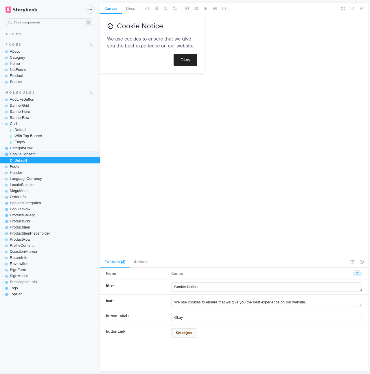
Storybook is a frontend workshop for developing UI components. It enables you to explore both simple and advanced components of Clay, including their various forms and parameters.
To launch Storybook, execute the following command:
npm run storybook
Upon successful build completion, your browser should open automatically.
The Storybook is structured into the following categories:
- Atoms - These are basic, standalone components.
- Molecules - These are more complex components that may incorporate multiple atoms.
- Pages - These represent complete page mockups and may incorporate any other components.
