Footer Menu
Customizing the Footer Menu
The Footer Menu is customizable using custom fields within the menu itself. Once you've created it, specify it in the config file using the footerMenuHandle.
Supported Content Models
The following content models are supported:
Social Button
The footer can display additional clickable social buttons with popular social platform logos.
The fields are as follows:
- Kind - Social platform kind. Select one from the list of supported options.
- Link - A link to your page.
Copyright Text
The footer can display copyright text.
Email Subscription (link)
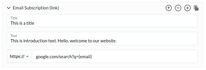
The footer can display an email subscription form. This variant will redirect the user to a provided URL. Before redirecting, {email} in the URL will be substituted with whatever the customer entered into the field.
The fields are as follows:
- Title - The title to display above the input field.
- Text - The text to display above the input field (smaller font than title).
- Link - A URL to open in a new tab.
{email}in the URL will be replaced with the content from the input field.
Email Subscription (form)
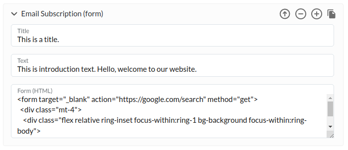
This is a variant of Email Subscription (link), which lets you override the form with custom HTML code. Consequently, the code will behave as you define it.
Here's an example that looks exactly like the built-in input field:
<form target="_blank" action="https://google.com/search" method="get"> <div class="mt-4"> <div class="flex relative ring-inset focus-within:ring-1 bg-background focus-within:ring-body"> <input name="q" autocomplete="off" class="py-4 bg-transparent w-full txt-field-placeholder text-ash placeholder:text-placeholder border-none focus:outline-none focus:ring-0 disabled:pointer-events-none disabled:text-button-disabled-text disabled:placeholder:text-button-disabled-text pl-5 pr-14" placeholder="Enter your email" type="text" /> <div class="absolute py-4 right-0 pl-3 pr-5 pointer-events-none"> <svg viewBox="0 0 24 24" fill="none" xmlns="http://www.w3.org/2000/svg" class="w-6 h-6"> <path d="M22 6C22 4.9 21.1 4 20 4H4C2.9 4 2 4.9 2 6V18C2 19.1 2.9 20 4 20H20C21.1 20 22 19.1 22 18V6ZM20 6L12 10.99L4 6H20ZM20 18H4V8L12 13L20 8V18Z" fill="currentColor" ></path> </svg> </div> </div> </div> </form>
NOTEEven though this example uses Tailwind class names, you can't freely use them from custom fields. This is due to the way Tailwind CSS is generated. If the Tailwind plugin cannot see the class in the source code of the Clay, it will not generate CSS classes for it. Thus it's only safe to use classes which are mentioned in the Clay source code. To learn more, read about Clay design customization.
The fields are as follows:
- Title - The title to display above the input field.
- Text - The text to display above the input field (smaller font than title).
- Form (HTML) - The HTML code to insert in-place of the form.


